Polymorphic Components
/
Polymorphic components are a React component pattern that enables us to create components with a dynamic root element.
As of React 19, ref is now available on components as a prop. This guide has been updated to reflect this change.
Showcase
In the following example, each button renders with a different root element.
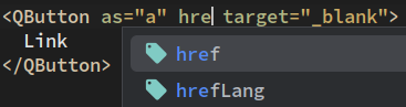
import {ReactNode} from "react"import {ExternalLink} from "lucide-react"import {QButton} from "@qui/react"export default function PolymorphicExample(): ReactNode {return (<div className="flex flex-col gap-4"><QButton color="primary" variant="fill">Button</QButton><QButtonas="a"color="primary"endIcon={ExternalLink}href="https://www.google.com"target="_blank"variant="fill">Link</QButton></div>)}
In addition to enhanced customization, this pattern will empower your developers with dynamic type inference based on the value of the as prop:
How To
@qui/react exports types to simplify the setup of polymorphic components.
import {As, PolymorphicComponentPropsWithRef} from "@qui/react"/* The default element used for the root node. */type DefaultAs = "div"export type ExampleProps<C extends As = DefaultAs> =PolymorphicComponentPropsWithRef<C,{/*** The component used for the root node. It can be a React component or element.*/as?: C}>export function Example<C extends As = DefaultAs>({as, ref, ...props}: ExampleProps<C>) {const Element = as || "div"return <Element ref={ref} {...props}></Element>}/*** If you want your components to show up properly in the React dev tools, use the* displayName property.*/Example.displayName = "Example"