Device Card
The device card is a specialized component intended for SAGA profiler applications.
import {QDeviceCard} from "@qui/react"
Examples
Showcase
EARLY ACCESS
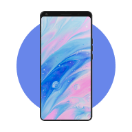
QRD8550
Snapdragon® Reference Design
import {ReactNode, SyntheticEvent} from "react"import {Check, Info, Settings2, Timer} from "lucide-react"import {QBadge,QDeviceCard,QIconButton,QStatus,useNotification,} from "@qui/react"const device = "/images/device-1.png"export default function Showcase(): ReactNode {const {notify} = useNotification()return (<QDeviceCardbadge={<QBadge color="yellow">EARLY ACCESS</QBadge>}description="Snapdragon® Reference Design"deviceChipset="SM8550 chipset"deviceOs="Android"footer={<><QStatuscolor="brand"icon={Timer}kind="icon"label="32 min remaining"subtle/><QStatuscolor="green"icon={Check}kind="icon"label="Available Now"subtle/><QStatuscolor="brand"icon={Settings2}kind="icon"label="3 configurations"subtle/></>}icon={<QIconButtoncolor="primary"denseicon={Info}onClick={(event: SyntheticEvent) => {notify({notification: {color: "informative",description: `Event type: ${event.type}`,icon: Info,label: "Info clicked!",},})}}size="s"/>}imgAlt="SM8550 chipset"imgSrc={device}label="QRD8550"/>)}
Content Customization
The Device Card is modular – most of its input properties accept either a ReactNode or string. The following example features a customized header, label, description, and footer. For a more generic card component, refer to the upcoming Card component.
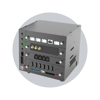
SA8540P
import {ReactNode} from "react"import {ChevronRight, Info, X} from "lucide-react"import {QButton, QDeviceCard, QIconButton, useNotification} from "@qui/react"const auto = "/images/automotive-1.png"export default function Customization(): ReactNode {const {notify} = useNotification()return (<QDeviceCarddescription={<span className="text-secondary q-font-metadata-lg">QNX 11</span>}footer={<div className="flex flex-col items-center"><QButton color="primary" dense endIcon={ChevronRight} size="s">New Automated Job</QButton><QButton color="primary" dense endIcon={ChevronRight} size="s">New Interactive Session</QButton></div>}header={<img alt="SM8550 chipset" height="128" src={auto} width="128" />}icon={<QIconButtondenseicon={X}onClick={() => {notify({notification: {color: "informative",icon: Info,label: "Info clicked!",},})}}size="xs"/>}label={<span className="text-primary q-font-heading-xxs">SA8540P</span>}/>)}
Badge Customization
Render a badge by passing the badge property, which accepts either a string or ReactNode. The badge's placement is also configurable via the badgePlacement property.
EARLY ACCESS
QRD8550
Snapdragon® Reference Design
NEW
QRD8550
Snapdragon® Reference Design
import {ReactNode} from "react"import {deviceCardClasses} from "@qui/base"import {QBadge, QDeviceCard, QDivider} from "@qui/react"const device = "/images/device-1.png"export default function BadgePlacement(): ReactNode {return (<div className="grid justify-center"><div className="flex flex-col gap-6 sm:flex-row"><QDeviceCardbadge={<QBadge color="yellow">EARLY ACCESS</QBadge>}description="Snapdragon® Reference Design"deviceChipset="SM8550 chipset"deviceOs="Android"imgAlt="SM8550 chipset"imgSrc={device}label="QRD8550"/><QDeviceCardbadge={<QBadge color="green">NEW</QBadge>}badgePlacement="top-right"description="Snapdragon® Reference Design"imgAlt="SM8550 chipset"imgSrc={device}label="QRD8550"metadata={<div className={deviceCardClasses.metadata}><span>SM8550 chipset</span><QDividerorientation="vertical"spacingAfter="8"spacingBefore="8"/><span>Android</span></div>}/></div></div>)}
Full Height
Use the fullHeight property to make the card take the full height of its container. For more complex layouts, consider using a utility like Masonry or Isotope.
EARLY ACCESS
QRD8550
Snapdragon® Reference Design
EARLY ACCESS
QRD8550
Snapdragon® Reference Design
import {ReactNode} from "react"import {CalendarPlus, Check, Settings2, Timer} from "lucide-react"import {QBadge, QButton, QDeviceCard, QStatus} from "@qui/react"const device = "/images/device-1.png"export default function Stretch(): ReactNode {return (<div className="grid justify-center"><div className="flex flex-col gap-6 sm:flex-row"><QDeviceCardbadge={<QBadge color="yellow">EARLY ACCESS</QBadge>}description="Snapdragon® Reference Design"footer={<><QButton color="primary" dense startIcon={Timer}>Purchase Minutes</QButton><div className="px-[7px] py-[2px]"><QStatuscolor="neutral"icon={CalendarPlus}kind="icon"label="Book for later"subtle/></div></>}fullHeightimgAlt="SM8550 chipset"imgSrc={device}label="QRD8550"maxLabelWidth="240"/><QDeviceCardbadge={<QBadge color="yellow">EARLY ACCESS</QBadge>}description="Snapdragon® Reference Design"footer={<><QStatuscolor="brand"icon={Timer}kind="icon"label="32 min remaining"subtle/><QStatuscolor="green"icon={Check}kind="icon"label="Available Now"subtle/><QStatuscolor="brand"icon={Settings2}kind="icon"label="3 configurations"subtle/></>}imgAlt="SM8550 chipset"imgSrc={device}label="QRD8550"maxLabelWidth="240"/></div></div>)}
Max Label Width
Long labels can be a problem, especially with user-entered content. Use the maxLabelWidth property to prevent the label and description from growing beyond a defined pixel width.
EARLY ACCESS
SM8550_Chipset_Android_Snapdragon
Snapdragon® Reference Design Chipset_Android_SM8550
import {ReactNode} from "react"import {QBadge, QDeviceCard} from "@qui/react"const device = "/images/device-1.png"export default function MaxLabelWidth(): ReactNode {return (<div className="grid justify-center"><QDeviceCardbadge={<QBadge color="yellow">EARLY ACCESS</QBadge>}description="Snapdragon® Reference Design Chipset_Android_SM8550"deviceChipset="SM8550 chipset"deviceOs="Android"imgAlt="SM8550 chipset"imgSrc={device}label="SM8550_Chipset_Android_Snapdragon"maxLabelWidth="240"/></div>)}
API
Props
| Name & Description | Option(s) | Default |
|---|---|---|
Action menu, positioned at the opposite end of the card's label. | ReactNode | |
Alignment of the card's content. |
| 'left' |
The component used for the root node. It can be a React component or
element. |
| 'div' |
The background color to apply from the theme. Maps to the
q-background- |
| '2' |
Content of the badge. | ReactNode | |
The style variant of the badge. |
| |
Placement of the badge. |
| "top-left" |
The className property of the Element
interface gets and sets the value of the
class attribute
of the specified element. |
| |
Card description, shown just below the title | ReactNode | |
Chipset, shown just below the description. If deviceOs is also provided, this
will render on the left-hand side. Otherwise, it is centered. |
| |
OS, shown just below the description. If deviceChipset is also provided, this
will render on the right-hand side. Otherwise, it is centered. |
| |
The elevation (box-shadow) level to apply from the theme. Maps to the
q-elevation-#number class. |
| 2 |
Footer content template. Rendered below the label, description, and metadata
container. | ReactNode | |
When true, the card will take up the full height of its container. |
| false |
Header content template. Rendered above the label. | ReactNode | |
lucide-angular icon, positioned in the top-right or top-left corner of the
card. | ReactNode | |
Props passed to the icon of type QIconButton, positioned at the top-right or
top-left corner of the card. |
| {} |
Color passed to the q-icon-button component when icon is supplied. |
| "primary" |
String id applied to the card's root container. |
| |
alt attribute applied to the image element. Does nothing if imgSrc is empty or
header is supplied. |
| |
src attribute applied to the image element. Does nothing if header is
supplied. |
| |
Label element (aka title), the card's primary message. | ReactNode | |
Supply this property to prevent the label from growing beyond a numeric pixel
width. The label will be truncated with an ellipsis if it extends beyond this
value. |
| |
Metadata section, shown just below the deviceChipset and deviceOs. | ReactNode | |
The orientation of the card. Sets the card in column- or row-based layout. |
| 'vertical' |
The padding, spacing, and size of the card's content. |
| 'm' |
The style global attribute
contains CSS styling
declarations to be applied to the element. | CSSProperties | |
ReactNode | ||
Subtitle placement relative to the label. |
| 'below' |
Type
ReactNode
Description
Action menu, positioned at the opposite end of the card's label.
Type
| 'left'| 'center'
Default
'left'
Description
Alignment of the card's content.
Type
| ElementType| ComponentType
Default
'div'
Description
The component used for the root node. It can be a React component or
element.
Type
| 1| 2| 3| 4| '1'| '2'| '3'| '4'| 'none'
Default
'2'
Description
The background color to apply from the theme. Maps to the
q-background- CSS class. This can be overridden using the
style prop.
Type
| 'brand'| 'red'| 'orange'| 'yellow'| 'kiwi'| 'green'| 'teal'| 'blue'| 'purple'| 'fuchsia'| 'magenta'| 'neutral'| 'neutral-dark'| 'positive'| 'warning'| 'negative'| 'informative'
Description
The style variant of the badge.
Type
| 'top-left'| 'top-right'
Default
"top-left"
Description
Placement of the badge.
Type
string
Description
The className property of the Element
interface gets and sets the value of the
class attribute
of the specified element.
Type
ReactNode
Description
Card description, shown just below the title
Type
string
Description
Chipset, shown just below the description. If deviceOs is also provided, this
will render on the left-hand side. Otherwise, it is centered.
Type
string
Description
OS, shown just below the description. If deviceChipset is also provided, this
will render on the right-hand side. Otherwise, it is centered.
Type
| 0| 1| 2| 3| 4| 5| '0'| '1'| '2'| '3'| '4'| '5'
Default
2
Description
The elevation (box-shadow) level to apply from the theme. Maps to the
q-elevation-#number class.
Type
ReactNode
Description
Footer content template. Rendered below the label, description, and metadata
container.
Type
boolean
Default
false
Description
When true, the card will take up the full height of its container.
Type
ReactNode
Description
lucide-angular icon, positioned in the top-right or top-left corner of the
card.
Type
Partial<QIconButtonProps>
Default
{}Description
Props passed to the icon of type QIconButton, positioned at the top-right or
top-left corner of the card.
Type
| 'inherit'| 'neutral'| 'primary'| 'positive'| 'warning'| 'negative'| 'contrast'
Default
"primary"
Description
Color passed to the q-icon-button component when icon is supplied.
Type
string
Description
String id applied to the card's root container.
Type
string
Description
alt attribute applied to the image element. Does nothing if imgSrc is empty or
header is supplied.
Type
string
Description
src attribute applied to the image element. Does nothing if header is
supplied.
Type
| string| number
Description
Supply this property to prevent the label from growing beyond a numeric pixel
width. The label will be truncated with an ellipsis if it extends beyond this
value.
Type
| 'horizontal'| 'vertical'
Default
'vertical'
Description
The orientation of the card. Sets the card in column- or row-based layout.
Type
| 'xs'| 's'| 'm'| 'l'
Default
'm'
Description
The padding, spacing, and size of the card's content.
Type
CSSProperties
Description
The style global attribute
contains CSS styling
declarations to be applied to the element.